Colors. They are the silent storytellers of our homes that define every mood and highlight every architectural detail. Imagine a house without it. A world of sterile gray and white would feel unfinished and lack the personality that makes a space truly feel like home. Picking the right shade is one of the most exciting parts of a renovation, yet it is also where most homeowners face their biggest surprise. You find the perfect swatch at the store, but once it hits your walls, it suddenly looks like an entirely different color.
This frustration is a common hurdle in the world of high end residential design. At AV Architects + Builders, we have spent 25 years refining the art of the perfect finish. Our team understands that a luxury home is a symphony of light and material, and we have seen how even the most beautiful shade can shift based on its environment. We prioritize a stress free experience for our clients by anticipating these changes before the first brushstroke ever touches the surface. While communication is always the key, we also believe in managing expectations so that every decision is made with clarity and confidence during daylight hours.
This article will dive into the hidden factors that change your paint color after it leaves the store. You will learn how the sun, the texture of the paint, and your own surroundings play a role in the final result. By the end of this read, you will have the knowledge to choose your palette with confidence and avoid the dreaded mid project color crisis.
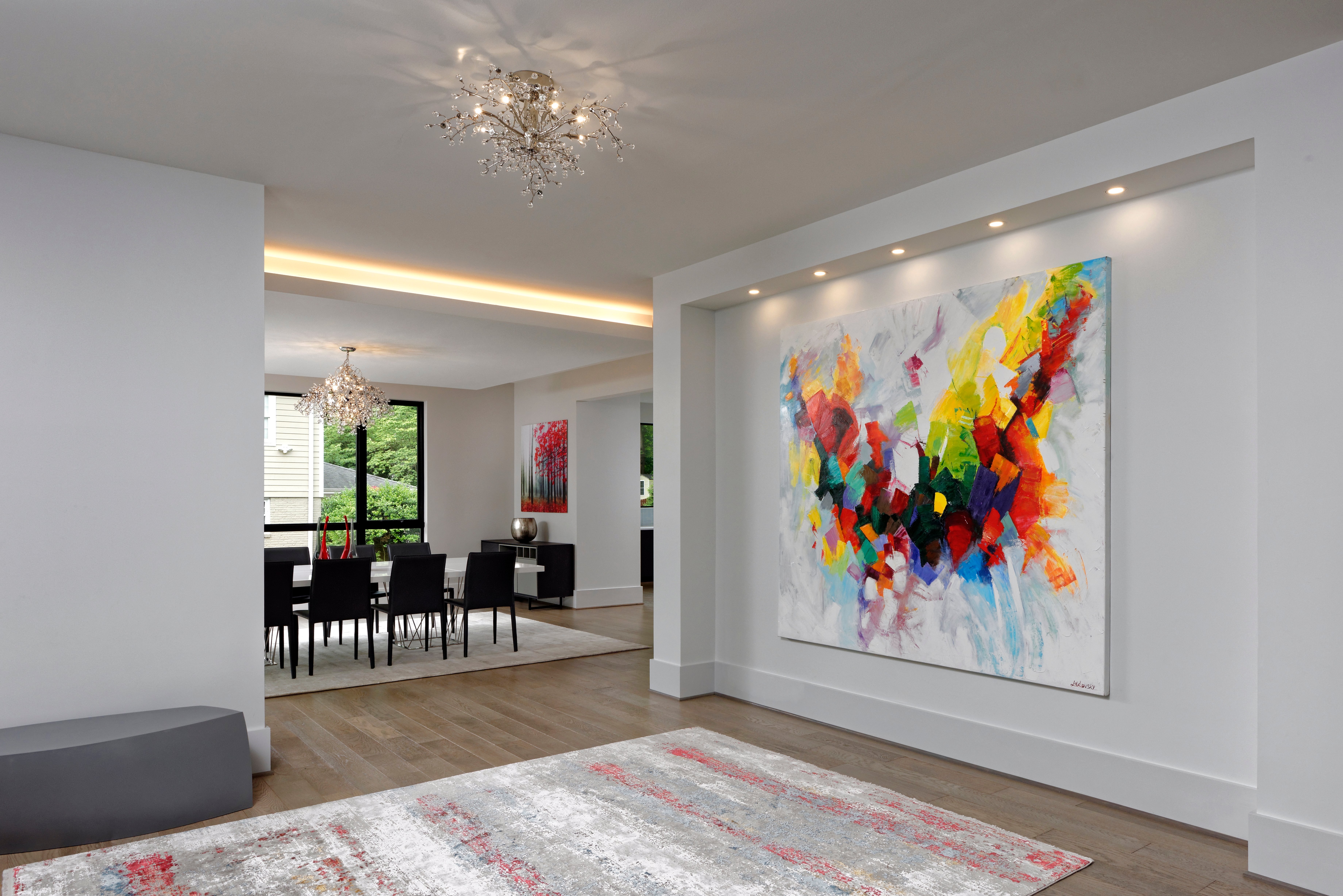
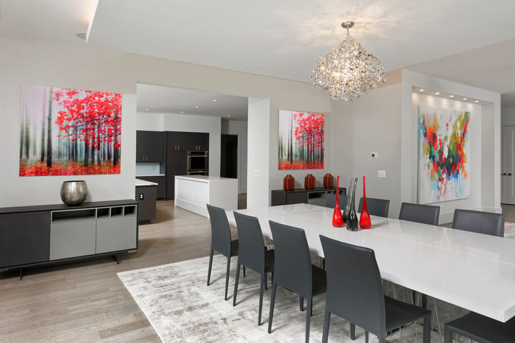
 The Hill House, McLean, Virginia, AV Architects + Builders
Why the Paint Color Looks Different on the Wall
The transformation of a color from a small swatch to a full scale wall is often the result of several environmental factors working at once. When you look at a tiny sample, your eyes only focus on a concentrated dose of pigment. However, once that color is applied to a large surface, it begins to interact with the volume of the room. This is why a neutral tan might suddenly reveal a hidden pink undertone or a soft gray might appear surprisingly blue once it covers four walls.
Think of it like a single musical note versus a full orchestra. A small swatch is just one note, but a painted room is the entire symphony where every surrounding element influences the sound. The size of the space, the height of the ceilings, and even the shadows in the corners change how your brain perceives the intensity of the hue. This is why we always emphasize seeing the color in its final context rather than making a snap decision at the paint counter.
Lighting Direction and Interior Paint
One of the most powerful influences on paint is the orientation of your room. Think of natural light as a tinted lens that sits over your walls all day. A room facing north receives a cool and bluish light that can make warm beiges look gray or even slightly green. Conversely, south facing rooms are flooded with intense and warm sunlight which can make a soft yellow look neon or a crisp white feel creamy.
The time of day also creates a shifting landscape of color. Morning light is often clear and cool, while the late afternoon sun provides a deep golden glow. If you only look at your paint sample at noon, you might be shocked by how moody and dark it feels once the sun begins to set. Understanding how lighting affects your interior and exterior paints is essential to ensuring your home feels cohesive from sunrise to sunset.
Choosing the Right Paint Finish
The texture of the paint is just as important as the pigment itself. Paint finishes act like mirrors with varying levels of intensity. A flat or matte finish absorbs light which creates a deep and velvety appearance that hides wall imperfections. This is a great choice for a sophisticated and understated look where you want the color to stay true and consistent.
On the other end of the spectrum, high gloss and semi gloss finishes reflect light. This reflection can make the color appear lighter or more vibrant than it actually is. It also picks up the colors of nearby objects like a bright green lawn or a red area rug. Learning how to choose the right paint finish for each room ensures that when light bounces off a glossy surface, it brings those outside reflections with it and subtly tints the color of your walls.
Professional Paint Sample Testing
The biggest mistake any homeowner can make is buying gallons of paint based on a tiny paper swatch. Those small squares are helpful for narrowing down your options, but they cannot account for the scale of an entire room. We always recommend applying a large sample directly to the wall or using a moveable adhesive board. This allows you to see the color in different corners of the space throughout the day.
Think of a paint sample like a test drive for a car. You wouldn't buy a vehicle without seeing how it handles on the road, and you shouldn't commit to a color without seeing how it handles your specific lighting. Testing a large area ensures that the undertones you liked in the store are actually what show up in your living room. It is a small step that prevents the costly and time consuming process of repainting an entire house.
Surface Material and Wood Grain Adhesion
Before you even open a can of paint, you must consider the canvas. Where are you applying the paint? Whether you are applying it to stone, metal, or wood, the material underneath dictates how the color is received and how it eventually looks. Different surfaces have different levels of porosity and texture which can swallow a color whole or make it stand out more than intended. A smooth metal surface will hold a color very differently than a rough piece of cedar or a porous concrete wall. The absorption rate and surface science basics matter just as much as the pigment itself.
To see this in action, imagine painting a modern accent wall that transitions from drywall to custom woodwork. If you use the exact same gallon of navy blue on both the smooth drywall and the grained oak panels, they will not look like a perfect match. The wood grain provides a natural texture that breaks up the light, often making the navy look richer and more organic. Meanwhile, the drywall offers a flat and consistent surface that might make the same blue appear more true to the swatch. Understanding these material differences helps you adjust your expectations and perhaps even choose slightly different shades or finishes to achieve a unified look across different parts of your home architecture.
Color Reflection and Interior Surroundings
Your walls do not exist in a vacuum. They are constantly interacting with every other object in the room. Imagine wearing a bright neon shirt and standing next to a white wall. You will notice a faint glow of that neon color transferring onto the surface. This same principle applies to your interior design. A large mahogany dining table can cast warm reddish tones onto neutral walls, while a lush garden seen through a window can bounce green light into a breakfast nook.
When choosing a color, it is helpful to consider the dominant elements already present in your space, especially when staying updated on color trends for your home. Your flooring, cabinetry, and even your neighbors house can influence how the pigment settles. At the high end level of home building, we look at the environment as a whole to ensure the paint color works in harmony with the landscape and the interior furnishings.
Metamerism in Artificial Home Lighting
The phenomenon where a color looks different under different light sources is known as metamerism. In a paint store, you are often looking at swatches under bright industrial fluorescent bulbs which are very cool and clinical. Once you bring that same swatch home and place it under warm LED lamps or incandescent bulbs, the chemical makeup of the paint reacts differently.
This is why a gray that looked perfectly neutral at the store might suddenly look purple in your bedroom at night. It is important to check your samples under the exact lighting fixtures you plan to install. This ensures that the atmosphere remains consistent whether you are enjoying a sunny afternoon or a dimly lit evening at home. For those looking to design the perfect bedroom for a new home, this lighting balance is a critical step in creating a restful sanctuary.
Complementary Trim and Wall Color
Color is a relative experience. A soft gray will look significantly darker when placed next to a bright white trim than it would if the trim were a dark charcoal. This is often called simultaneous contrast. Your eyes perceive the intensity of a color based on what is sitting right next to it.
If you are painting a small powder room, a color might feel more intense because it is reflecting off itself in a tight space. In a large open concept great room, that same color might feel washed out and subtle. We recommend looking at your paint samples alongside your actual trim and flooring materials to see how they complement one another. This is especially true when considering modern home window design where the frame color can drastically shift the perceived wall hue.
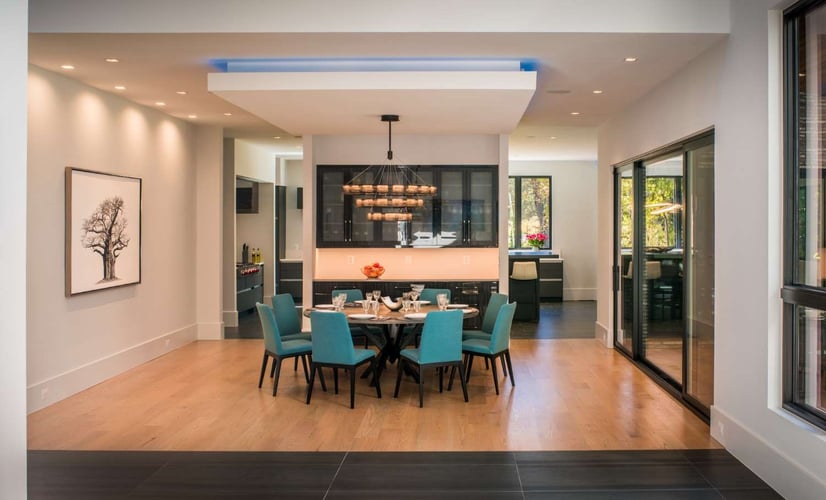
 The Hill House, McLean, Virginia, AV Architects + Builders
Summary for Mastering Your Palette
Mastering the look of your home requires a blend of technical knowledge and practical observation. Always remember that light is the primary driver of color perception, meaning the quality of your light bulbs will change the mood of the room throughout the day. We have written extensively on the countless natural light benefits that come with thoughtful architectural planning. Choosing the correct sheen is equally critical, as the reflection of a gloss finish interacts with your space differently than a matte one. Furthermore, never underestimate the power of your surroundings and the texture of your surfaces to pull hidden undertones out of a pigment.
The most reliable way to ensure satisfaction is through rigorous large scale testing. By observing samples in their intended environment and alongside existing architectural materials, you remove the guesswork from the process. These steps allow you to manage expectations and ensure that the vision you have for your home matches the reality of the final product. Taking a slow and methodical approach to these details is what separates a standard renovation from a truly professional and high end finish.
Design Build Project Management Expectations
The process of selecting the perfect palette requires patience and a bit of a reality check. It is helpful to remember that color is dynamic and will never look exactly the same at 10 AM as it does at 8 PM. Accepting this movement allows you to choose a shade that you love in its most dominant state. For a deeper look at how we light custom homes to enhance these aesthetic choices, our design-build methodology is key.
We emphasize that communication is the key to a smooth project, but it is also important to manage expectations regarding the timeline. Rushing a color choice usually leads to second guessing. By taking the time to observe your samples over a few days, you avoid the stress of a last minute change that could stall the momentum of your build.
If you are ready to start your next project with a team that values precision and design excellence, we invite you to reach out. You can schedule a discovery call with our experts to discuss your vision or visit our learning center for more insights on luxury home building.
Topics:
